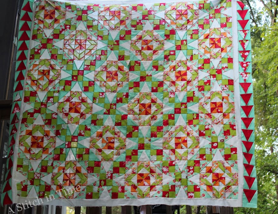
I started first with the idea of making the pieced border the third and outer border. I went with a border of white and then with green.
Had to see in that photo - here is another angle
The quilt was reading as too green.
Next step was to take the tri-rec blocks I made - like the ones on the right, and sew that against the green. Nope - wasn't happening for me. They just didn't look right against the green.
So I removed the green border and went with the 2nd border as the tri-recs. Quilt doesn't read so green any more - which is good. However, that red really catches the eye. I'd prefer to see the aqua catch the eye. I want to help one see the 'circles' that the blocks form.
After I get the top and bottom tri-rec border on, I will audition different out borders - I'm thinking about aqua or white. (None of these photos are truly capturing my colors here.)
Any thoughts here for me?
Interested in winning a tote bag - enter my giveaway here! (closes Sunday, July 13)
Happy Stitching!


Love the colors that are in this quilt. It is just sweet and romantic and I agree the color placement does enhance the circles which I love when I look at your version of the celtic solstice.
ReplyDeleteMaybe an aqua outer border will lift the aqua in the quilt and make the circles stand out? That would be my recommendation to try. I'm so late reading this, you've probably already done the border.
ReplyDelete